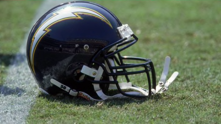
Where would you rank the logo of the Los Angeles Chargers among those of the other 31 NFL teams? Recently, Fanjuicer.com conducted a survey to see where fans ranked each logo.
The MaxDiff research study, which nearly 1,500 NFL fans participated in, produced results ranking all 32 NFL logos. The logo of the New Orleans Saints ended up being No.1 while the logo of the Cleveland Browns, which is nothing more than an orange helmet, came in last.
The Chargers finished somewhere in the middle.
Actually, the Chargers’ lightning bolt logo came in at No. 19 on the list. The logos were also reviewed by a graphic designer who provided their own critiques about each logo. Here’s what that graphic designer had to say:
My first thought is that it is unusual to see the lightning bolt in a rounded format. The shape does serve the purpose of keeping it from looking generic or a like copy of the Gatorade logo. I’m not saying I dislike the shape, but there’s something about it that is causing hang-ups for me.
More from Bolt Beat
- LA Chargers: 4 questions surrounding the defense in 2021
- Derwin James injury history and outlook for 2021 season
- LA Chargers: 3 improvements for Justin Herbert to make in 2021
- LA Chargers: 3 reasons why the Bolts are a legit Super Bowl dark horse
- LA Chargers: 3 recently drafted players that could be cut before season
The Chargers’ logo, at least the one on the team’s helmet, has always been a lightning bolt. Though the color of the helmet and even the color of the lightning bolt itself have had a few variations, the shape of the bolt has stayed consistent. At one time, the team did use a shield logo that featured a lightning bolt and a horse, though it never appeared on a helmet.
Perhaps it is the shape of the logo, but this graphic designer can’t put their finger of what the problem with the logo is.
I’m having trouble figuring that out, but there is something. While I don’t dislike the shape, some of the angling of the lines kind of makes it look like a head of hair. Some of that angling does make it feel unnatural and somewhat clunky. There’s a bit of unnaturalness to it because a lightning bolt is not supposed to look this way. It can feel a little odd at first glance.
Still, is this a logo that should be ranked in the bottom half of the league? Fans of the Chargers would likely say no and would likely feel it should be much higher on the list.

How do you feel about the team’s logo? And what is your favorite uniform the team has ever worn? Take a look at the history of the team’s uniform and let us know in the comment section. Navy blue helmets? White helmets? Powder blue jerseys?
For me, it’s the uniform that the team wore from 1992-2004. The Chargers just happened to make their only trip to the Super Bowl in those uni’s.
